Rethink, Restore, and Repurpose: A New Design for K-State’s Historic Seaton Hall Complex
Walking through BNIM, there is an unmistakable presence — chipboard models with columns of Corinthian order, original blueprints (yes, the blue kind), and LED monitors lit with laser scans of buildings detailed enough to show the exact split-face depth of 1870s limestone blocks. These unique interactions between old and new fuel BNIM’s passion for renovations and adaptive reuse projects.
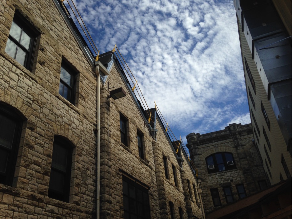
Working on aging buildings reveals one common truth: each has its own incredible story. BNIM, in partnership with Ennead Architects, is completing a renovation and addition to two historic buildings at Kansas State University. Seaton Hall (1922) and Seaton Court (1874) are both categorized by the Kansas Board of Regents as among the bottom tenth percentile in average building condition relative to their campus as a whole. This particular project explores how a complex of dissimilar historic buildings can be repurposed and expanded to support evolving educational approaches across architecture, landscape, interior, and planning programs.
Now, one year into construction, we’ve seen it all — the good, the bad, and the ugly. Conceptually speaking, inserting a library, design studios, critique spaces, offices, and a nearly 300-seat auditorium into two of the oldest campus buildings in the state has revealed a powerful story of adaptive reuse and the enduring lifecycle of buildings. Pragmatically speaking, the lessons learned are equally compelling. The following is a brief overview of our story:
FINDING AND CREATING SYMBIOSIS
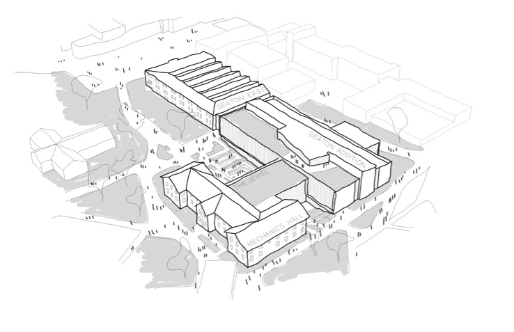
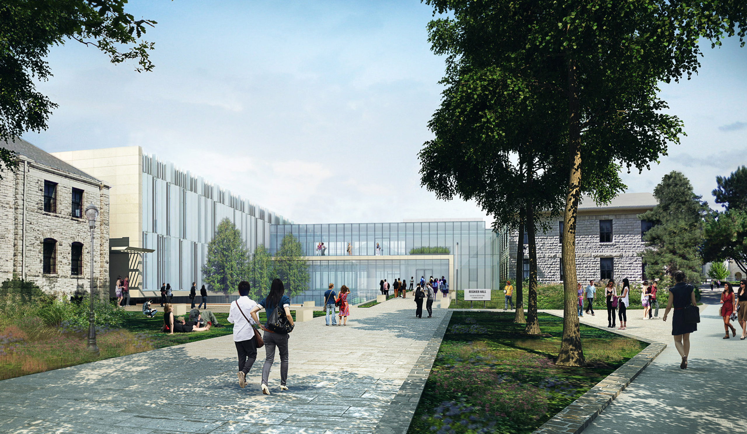
The major components of this project are, from far to near: the renovation of Seaton East; the new Seaton Addition, designed to appear as its contemporary appurtenance; “The Jewel,” an open-volume container intended to act as a welcoming front door; and the renovation of Mechanics Hall. Both components of new construction take the place of the entirely demolished Seaton Court building. Fundamentally, each building is celebrated for what it is, but at various scales there is a careful cross-pollination of character and experience.
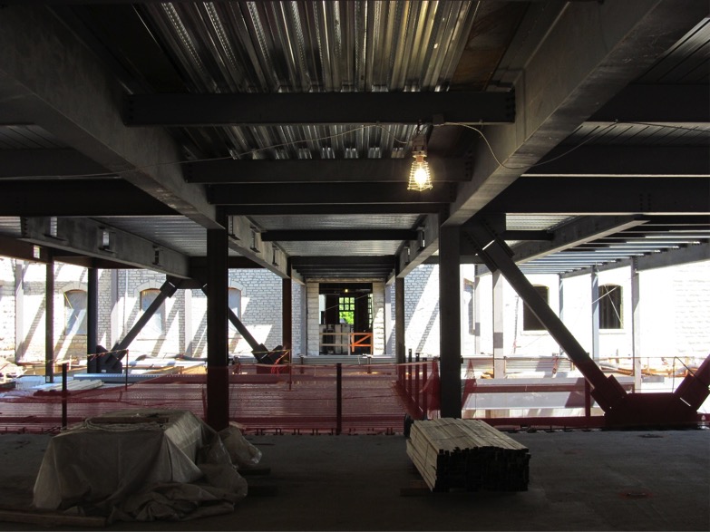
ABOVE: TWO MAJOR CORRIDORS MAKE THEIR WAY THROUGH THE COMPLEX — NORTH/SOUTH AS A CONTINUATION OF THE SEATON EAST CORRIDOR AND EAST/WEST AS A CONTINUATION OF MECHANICS HALL (SHOWN HERE). THUS, THE ORIGINAL BUILDING GEOMETRIES ESTABLISH THE ORGANIZATIONAL AXIS FROM WHICH THE ADDITIONS ARE COMPOSED, UNIFYING THE EXPERIENCE BETWEEN AND WITHIN EACH SPACE.
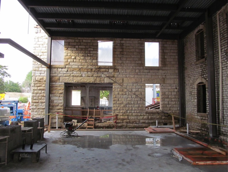
ABOVE: THE JEWEL INCLUDES A LIBRARY, LARGE MEETING SPACES, INFORMAL LOUNGE AREAS, AND THE LOBBY TO THE AUDITORIUM (ABOVE). HERE, THE EXISTING WALLS OF MECHANICS HALL ENCLOSE THE SPACE ON TWO SIDES. TO THE RIGHT IS ORIGINAL 1870S RUBBLE-TYPE LIMESTONE, DIRECTLY AHEAD A 1910 ADDITION WITH ITS LARGER FORMAT MONOLITHIC LIMESTONE. TO THE LEFT WILL BE A FULL-HEIGHT WALL CLAD IN NEW, HONED, COTTONWOOD LIMESTONE — TELLING THE STORY OF EVOLVING LIMESTONE MASONRY MATERIALS AND CONSTRUCTION METHODOLOGIES IN ONE SPACE.
ABOVE: WITH NEARLY 300 SEATS, REGNIER AUDITORIUM WILL HOST VISITING LECTURERS, CASUAL CRITIQUES, AND CAMPUS EVENTS. THE ONCE TWO-STORY SPACE WILL BECOME ONE LARGE VOLUME, REBUILT OF NEW STEEL MEMBERS WHOSE PROFILES AND SPACING ARE INFORMED BY THE GEOMETRY OF THE EXISTING GABLED END WALLS AND RHYTHM OF THE WINDOW OPENINGS.
DISCOVERIES AND OPPORTUNITIES
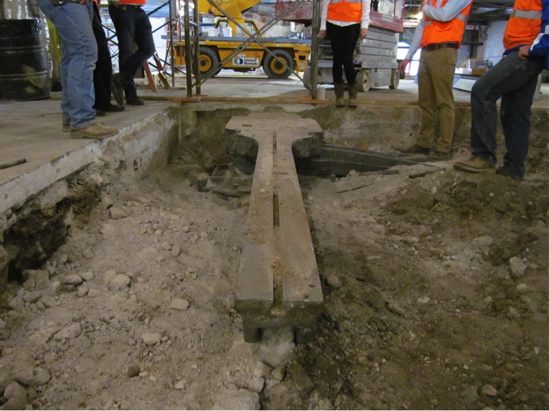
In “The Starting Point (Cloud)”, we’ve discussed how BNIM leverages point cloud technologies in our new building and renovation projects (bnim.com/blog/starting-point-cloud). Even with this technology, we found many surprises when we began to peel back the layers: centuries-old brick foundations, mortar so weak it could be removed by hand, a ziggurat-esque 30’x30’x15’ underground foundation, and a massive anvil once used to test the compressive strength of materials (above). That said, for every unanticipated condition we thoughtfully honored the idiosyncrasies of these historic buildings.
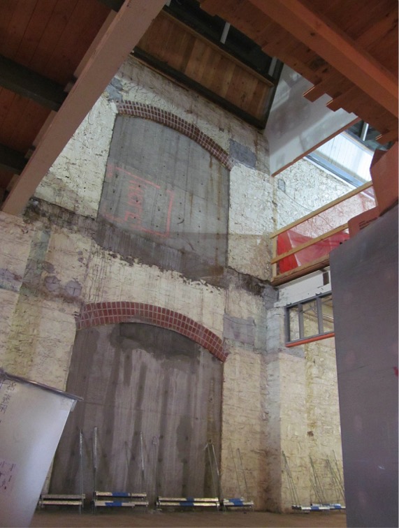
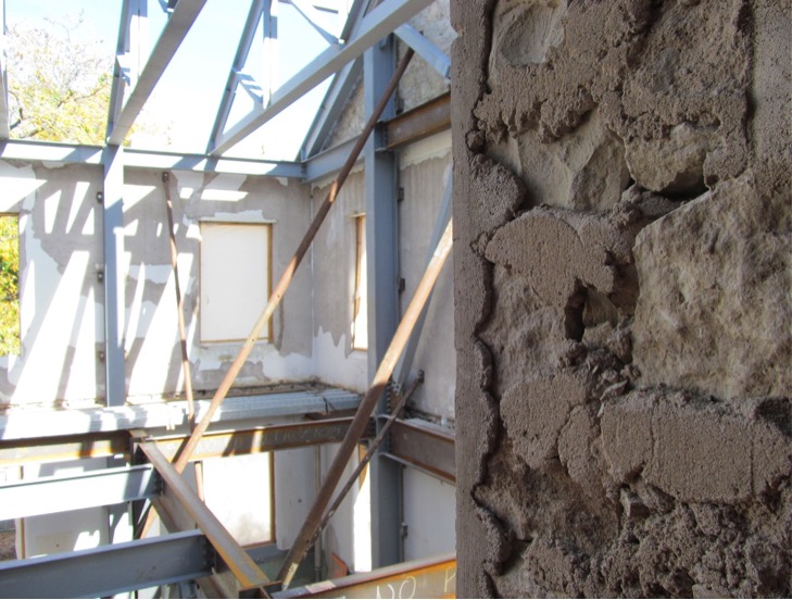
ABOVE: INSIDE SEATON EAST, THE CORRIDOR THAT ONCE SPLIT THE BUILDING IN HALF LENGTH-WISE HAS BEEN RELOCATED IN FAVOR OF A MORE EFFICIENT OFFSET LAYOUT, CREATING STRONGER ADJACENCIES BETWEEN FACULTY OFFICES, CRITIQUE SPACES, AND STUDIOS. ANOTHER RESULT IS SEVERAL LARGE, TWO-STORY “PORCH” SPACES (SHOWN HERE, PRIOR TO TOUCH-UP AND FINISHING) THAT PROMOTE NATURAL LIGHT, PROVIDE CONNECTIONS BETWEEN SPACES, AND PROUDLY FRAME THE FORMER CORRIDOR OPENINGS.
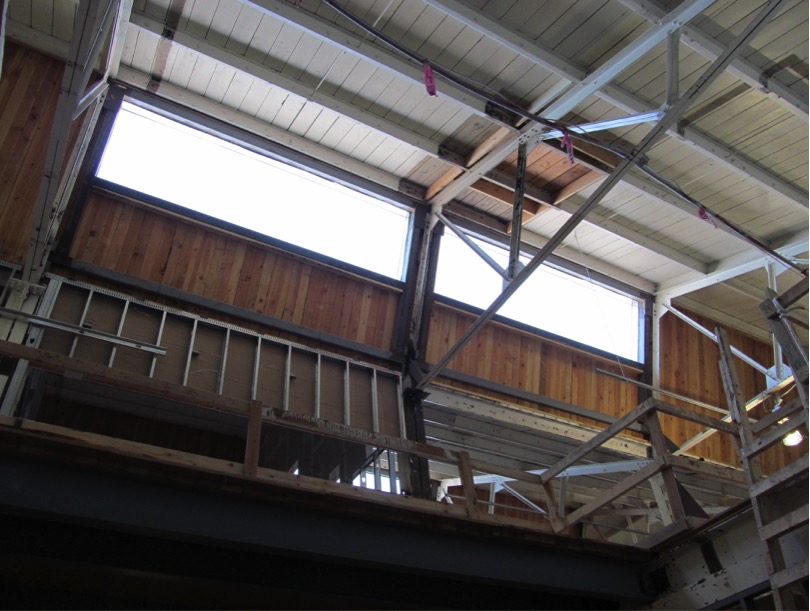
ABOVE: CAREFUL STUDY USING DAYLIGHTING ANALYSIS TOOLS INFORMED THE EXTENT AND HEIGHT OF THE NEW SKYLIGHTS WITH RESPECT TO THE EXISTING SAWTOOTH GEOMETRY. THE ORIGINAL GLAZING (WHICH HAS LONG BEEN ROOFED-OVER) HAS BEEN REPLACED WITH NEW SLOPED GLAZING UNITS, MISCELLANEOUS SUPPORT STEEL, DECKING, AND ROOFING.
CLOSING
Today, our built environment is strewn with historic spaces that take our breath away, make us feel small, and prompt the question, “Where did all of the real craftsmen go?” But the unfortunate truth is that a growing number of these spaces no longer suit and inspire, or keep their users safe. As designers, our most powerful tool is problem solving. At BNIM, we believe the success of these projects can be measured by how we embrace existing conditions and allow new generations to imprint their own story.
Stay in touch with construction progress on Instagram and via the live construction camera.
Source: Report on State University Deferred and Annual Maintenance
Also posted to Medium.
