Mastering the Module: Unlocking the Miesian Grid in Miesblock
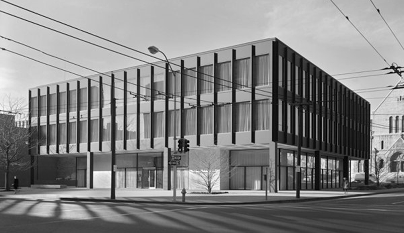
When it comes to the evolution of Modernism, few names have more recognition than Ludwig Mies Van Der Rohe. This seminal architect — often associated with such phrases “less is more” and “God is in the details” — designed the Federal Home Savings and Loan building in 1962. The 3-story jewel in the heart of downtown Des Moines, Iowa is currently occupied by the Catholic Diocese of Iowa and still serves as a beacon for modern enthusiasts.
BNIM was recently hired by a local developer to design a mixed-use residential building to inhabit the same city block adjacent to the west of Mies’ project. In designing the new development, known as Miesblock, the immediate question became: how do you design next to Mies and respect but not imitate a building of this significance? We set out to respect the importance of the building by creating a similar refinement and timelessness — all while utilizing the materials and technologies of today on a modest developer budget.
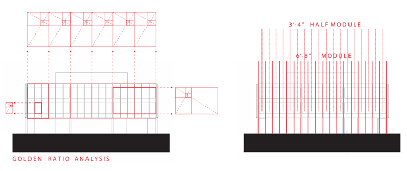
The organizational diagram of Miesblock comes from the dissection of Mies’ famed module. The original building is a 120-foot box split into 3 equal bays of 40-feet each. This is further divided into 6 equal bays of 80-inch windows, which transfers to a 40-inch module at the ground plane. The 40-inch module became the datum that extends across the site to inform Miesblock in both plan and elevation.
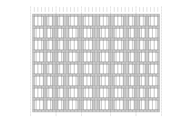
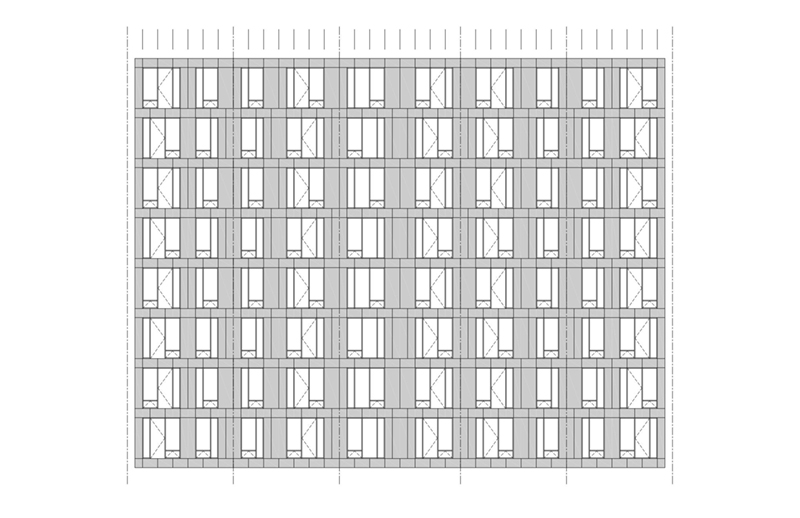
The resulting skin is expressed as a continuous wrapper around the building, cut away to varying degrees based on the commercial or residential program behind it. A half module dictates the shifting of the 40-inch spacing at every other level to reinforce a continuous texture, rather than expressing a vertical structural system. This variation creates a scale that is sympathetic, but dynamic. Balcony doors and operable windows punctuating the façade add another layer of texture.
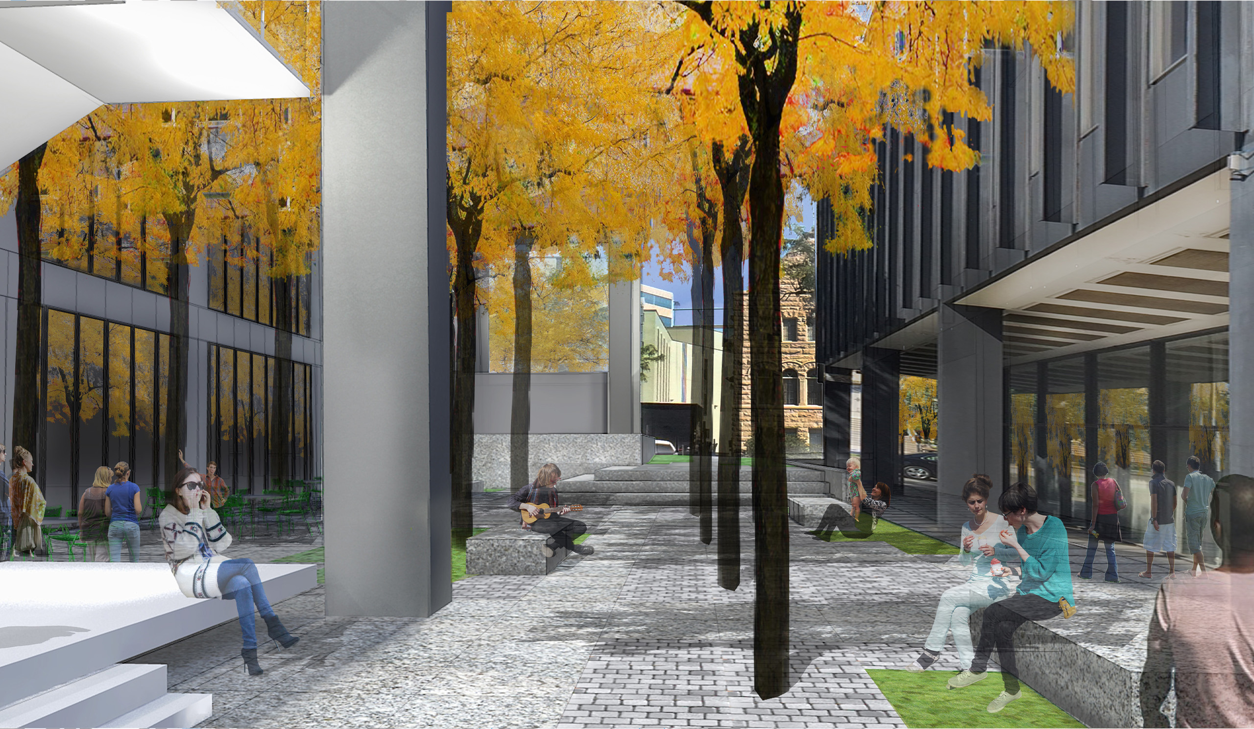
At the base of the building, the site provided an important mechanism to connect with the original work. By positioning the footprint of Miesblock for maximum length in the north-south direction and arranging the building face tight to the urban street front to the west, we realized an interior courtyard space between the two buildings — a critical move to provide interstitial space around Mies’ pavilion-like design and breathing room for the buildings to coexist contextually. As a nod to Mies’ well-known strategy of connecting with nature, we extended the existing granite pavers into the adjacent urban plaza to anchor these buildings spatially. A new grove of Honey Locusts connects to the existing landscape within the public plaza, further unifying the site. At the base of Miesblock, the bottom three levels are cut away at the southeast corner, creating additional porosity between the two buildings, and framing an entry to the plaza space beyond. An open stair at this corner provides vertical connection to Des Moines’ skywalk system, and activates the newly unified plaza.

The result is a building that is restrained, but possesses a shifting dynamism amongst its refinement and rigorous details. The two buildings — original Mies and Miesblock — come together in a holistic design moment bridging differing scale, program, building systems, and materiality into a synchronized urban experience.
Owner – Nelson Construction and Development – Des Moines
